2D Foundations

Sunday, September 17, 2006

Image Essay #4


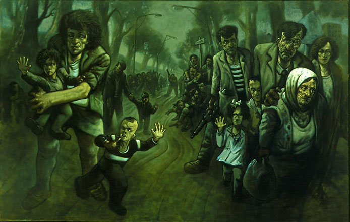
I chose this image by Scottish artist Peter Howson, entitled Road to Zenica. I believe this is a good representation of some of the topics covered in class this week. Not only is the circuit of meaning relatively open for interpretation, there are lots of small details. Needless to say, I spent a long time staring at this image attempting to make sense of it. There is a lot of depth as the image stretches back and includes a lot of people. Diagonals are also rampant, creating a very interesting composition with an illusion of space. The painting has a depressing appearance to it, and while the figures are very detailed, they're also distorted somewhat.


Initially the composition, while aesthetically pleasing, made little to no sense. I could gather that the people in the painting were migrating away from something, but I had little idea what. After a little research, I discovered that Zenica is a city in Bosnia and Hertzegovina that played a key role in the Bosnian War from '92 to '95. The city became a refugee center for ethnic Bosniak refugees seeking to escape the ethnic cleansing of the time. After a second viewing with this knowledge, the artist does a good job in capturing the mood of desperation and sorrow.


I found out about Peter Howson because he actually painted the cover of one of my favorite band's album covers. Live's 1994 CD, Throwing Copper has an image by Howson entitled Sisters of Mercy. That image always had an interesting look to it - I spent countless hours staring at that one.

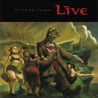
Above: Live - Throwing Copper

Image Essay #3


In this piece by artist Chet Phillips, there is a good amount of tension. The round shapes of the animals in the boat are very circular in comparison to the very linear water and lines within the shapes. The cat's head is the dominant element in this work. The image also gives a good sense of movement – the eye goes from the cat, down into the water, up to the island, to the lighthouse – and around to the moon to where the viewer started. The subordinate shape is the owl, which is the second most important element of the image.

The author, Chet Phillips, has a very unique style. Looking at his site, he draws lots of animals along with lots of landscapes. After browsing his site, it appears he has done a lot of work for the Harry Potter series. Lots of assorted sketches and works are done by Chet Phillips for Warner Brothers.

This image has elements of tension, a clear dominance structure, and encourages movement around the work, so it seemed like a natural choice. There are also varying line weights and diagonal lines which provide depth, so this image encompasses lots of the concepts discussed in the past weeks.

Tuesday, September 05, 2006

Blog Entry #3

1. Before this Blog Assignment, had you ever kept a journal, diary, or blog? No.

2. Before this Blog Assignment, had you ever written about art before? A few times. Definitely not extensively.

3. Have you ever written for fun (poetry, fiction or non, journalistic, or research)? Often; journalistic. My dream job since I was little was to be a sportswriter but there is not the same circulation newspapers once enjoyed.

4. When writing, do you use a dictionary or thesaurus? Neither. I think it's like a soldier not wanting painkillers. Heck, I even code HTML in Notepad.

5. If given a chance, would you rather discuss art verbally or through written means? Written.

6. How would you rate your overall vocabulary? Above average.

7. How would you rate your vocabulary of art terminology? Below average.

8. How would you rate your writing abilities? Confident.

9. How would you rate your writing abilities when writing about art? Insecure.

10. How would you rate your ability to use specific vocabulary when writing? Average.

Image Essay #2


I chose this work by David Salle entitled Nouns. I think it is a good representation of some of the topics we covered in class this previous week. Salle's circuit of meaning here is very open, I think. The title does not help too much; nouns are virtually anything that can be drawn. The images are all easily recognizable, so there is a lot of iconography. Personally I can't make some type of profound insight on what this work might mean, so to me the circuit of meaning is very open. However, the image is aesthetically pleasing and there probably is a deeper meaning that I cannot derive.

The work has different panels with pictures inside each one, so I'm assuming the creator wants the viewer to look at is as you read a sentence, from left to right. The images all have names for them as well, and there is a site which lets you view them up closer. The titles are all one word and they are indeed nouns as the work's name would imply. There are a lot of linens throughout the image as well as statues, which together amount for about half of the imagery. Also it appears that the images with solid-color backgrounds go together in groups of four. Whatever the artist is trying to achieve, it is beyond my comprehension, so the circuit of meaning is very open for interpretation here.