2D Foundations

Wednesday, November 29, 2006

Image Essay #15


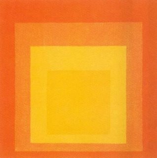
The image above is a study by Josef Albers entitled “Homage to the Square,” which is actually part of a series. This particular image is very monochromatic – it has varying shades of orange. The repeated square shape helps reinforce this. It is said that the square is the “ideal” shape for his study because squares are related to each other in size (proportionally). The artist also pointed out that squares do not occur in nature, therefore it is man-made. I do not think that the image would be nearly as effective if the shape were circular or even a rectangle. The square is what makes this piece memorable.

Albers is credited for influencing geometric abstraction and minimalism. He was very interested in the psychological effects of color/space. It was his goal to question perception and its effects. The image forms kind of an optical illusion because the colors are changing and seem to be moving. They somehow support and oppose one another at the same time. Much like Kandinsky mentioned in a previous entry, Albers influenced abstraction heavily. While the shapes are simple, his studies were very extensive and it is reflected in the complexity of the image.

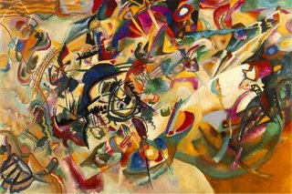
Image Essay #14


The piece above is a wallpaper for the online game World of Warcraft, made by my favorite company, Blizzard Entertainment. Their artwork has always astounded me. The logo itself has complimentary colors of a light blue and a dark yellow/orange. The dwarf on the right is painted in mostly earth tones, which make the gun stand out and come forward in the image. This adds a sense of three dimensionality. The background is a dwarven city in the mountainside. The borders on the top and bottom are also earth tones, which match the dwarf and serve to bring the logo and background image forward. It also employs the Gestalt principle of closure.

World of Warcraft is a video game, but even moreso it is a work of art. I have not been captivated by a video game like this at any point in my life, though I think I am a bit predisposed to playing video games. It could be argued that the first time I picked up a controller my life was altered, as I long for a career inside the industry. Working at Blizzard Entertainment would undoubtedly be my dream job. Everything in World of Warcraft was hand drawn. Everything. There was so much time put into that game, it really pales most other games for me. The game retains its cartoony look, but I personally prefer it over the more realistic looking games showcased nowadays with the next-gen consoles out. At any rate, World of Warcraft has set a fine example for games to emulate over the next few years and it will be interesting to see if another game could dethrone Blizzard.

Image Essay #13

Above is an image by famous Russian artist Vasily Kandinsky. "Compisition VII" was painted in 1913. Kandinsky himself said that this was his most complex piece of art. The colors are simply beautiful. Kandinsky was influenced heavily by music in his abstract pieces. His theories on music and art made him a widely respected art theorist as well. In his own words, Kandinsky said that "...color could be used in a painting as something autonomous and apart from a visual description of an object or other form." I personally find Kandinsky's pieces very gripping because I have always found color and abstraction to be more interesting than realistic painting. Kandinsky's theories are quite influential even today and it is easy to see why - he was one of the first defenders of abstraction and commanded respect.

Kandinsky is Russian and is credited as the first abstract painter. He studied law and economics in school but always had an interest in painting, though he was not considered an artist by profession until he was 30. Kandinsky moved to Germany and taught there until the Nazis closed down his art school in 1933. He then moved to France where he would spend the rest of life, becoming an official citizen in 1939. His theories on art and spirituality (and their relevance to one another) are still studied to this day. He published a number of books about the aforementioned theories that are still available.

Image Essay #12


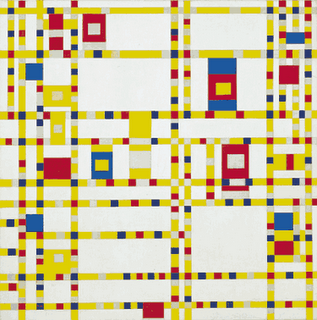
In this very famous composition by Piet Mondrian called "Broadway Boogie Woogie," the artist really plays on a dominance structure and the use of triadic colors, or three colors of equal separation on the color wheel. The colors employed in this piece are yellow, blue, and red. By its very simple yet energetic composition, the viewer's eye is led all around the picture plane. There is a strong sense of movement in this piece. The squares seem to leap from the canvas and draw the viewer in. The fact that there is a triadic color scheme seems to cause the blues and reds to jump out.

The grid is actually real-world inspired. It is a city grid of Manhattan in New York City, and it is said that Mondrian enjoyed dancing to "boogie woogie" music. This piece also shows the influence that Mondrian had on modern day advertising and design. This grid look is used very often in advertisements. I have seen this particular piece (and others by Mondrian) without knowing exactly what they were. It is easy to see that Mondrian was very influential to modern art as we know it today and its continuing evolution in the future.

Image Essay #11


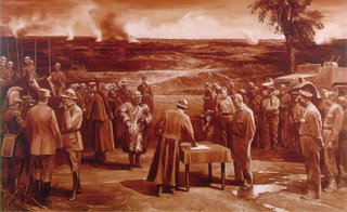
This is an image by American postmodern painter Mark Tansey entitled "Triumph of the New York School." In terms of the color selection, the piece is quite obviously monochromatic. The textures are emphasized in the various uniforms and surrounding landscape. The piece looks like a normal military surrender scene upon first inspection, but further review would alter that perception. On the left side of the table is what appears to be a French unit of World War I, while on the right there are clearly American G.I.'s of the Second World War. This, of course, would not be possible in reality because France and the United States never fought. Therefore, for interpretation, the deeper meaning has to be observed.

The "battle" cited in this painting is the rivalry between the art schools of New York and Paris, respectively. There are famous painters of the era within the piece, as well. Andre Breton, the famous surrealist, signs a treaty acknowledging defeat. Clement Greenberg is at his right, suited in the khaki G.I. getup. Behind him are Jackson Pollock, Willem de Kooning, and Robert Motherwell of the New York school. Henri Matisse and Pablo Picasso are also painted into the picture for the French side.

Overall this is a very interesting piece with several layers of meaning applied. It is also a great example of an allegory as discussed in class with the example being Alice in Wonderland. Tansey does a great job in this piece which makes it both gripping and memorable.

Image Essay #10

This is a piece by famous Impressionist painter Claude Monet entitled "Water Lillies." Monet was always very interested in the effects of lighting and reflections, and this piece shows a definite mastery of the subject matter. The piece is very intense and vibrant. There are analogous colors in the blue and purples of the water, which serves to make the lilies stand out. I personally think it is a very interesting selection of colors, but that was the trademark of the Impressionist style. It's just amazing because I know I would never be capable of painting anything like this.

Monet was very influential in the Impressionist movement as well as art in general. The term Impressionism was even derived from one of Monet's more famous paintings. Unlike most artists, he was fairly famous during his lifetime. Monet also had a lot of “series” paintings. He would paint the same object in different lighting conditions. It is very interesting to see his series of haystacks painted at different times of day. It really showcases the mastery Monet had over lighting. According to some historians, Monet suffered from cataracts in both his eyes, which he had surgery to correct. After the surgery it has been suggested that he was able to see ultraviolet wavelengths of light.

Image Essay #9


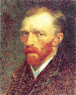
In class we were discussing the role of color in compositions. It was said that color not only enriches, it complicates the experience. When I think of color in painting, I think of Vincent Van Gogh. This is a self portrait from 1887, and his style is definitely evident here. There seem to be lots of earth tones in this work. There is a hint of blue and orange in Van Gogh's beard which seem to be split complimentary colors.

Van Gogh was born in 1853 and was a Dutch painter. He is generally classified as a Post-Impressionist painter. His paintings are some of the best known and popular works in history. The part that I found interesting about Van Gogh, though, is that he is the classic example of the "tortured genius" - he suffered from some type of mental illness. During one especially violent episode, he cut off part of his own ear. Another interesting tidbit about Van Gogh is that he did not “officially” become an artist until 1880 when he was 27 years old. All of his works, then, were produced in the last ten years of his life. Van Gogh's mastery of color and of the self portrait make his legacy relevant in today's world of art.