2D Foundations

Wednesday, December 06, 2006

Blog Entry #5

The artist I looked up was Mark McKean. He is a British artist and has contributed heavily to many fields. His contributions to digital art are what intrigued me most. He has done a lot of artwork, also, for musician's CD covers. (Toad the Wet Sprocket among them, one of my personal favorites.) He does not particularly stand out in the field of digital art for the digital art itself, but because his art is so eclectic. He has done so much that it is impossible not to be impressed. The most impressive part of Mark McKean's work is that he has done it all. He has even directed movies.

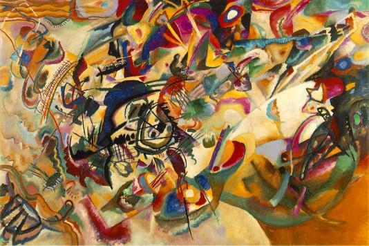
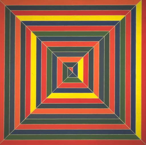
McKean uses dominance heavily in color, as evidenced below:


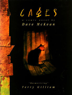
There is a clear dominance structure rooted in color, which leads to movement around the image. This particular work is the cover of his renknowned graphic novel. There were actually ten separate comics about artists and creativity, but they were combined to form this graphic novel.


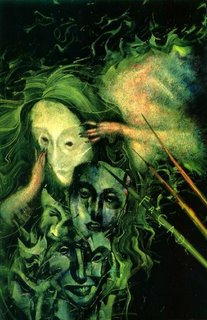
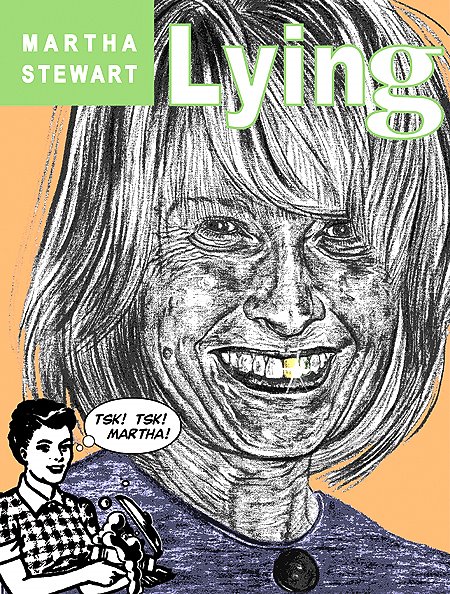
The human form is subject to many of McKean's works, and he keeps it fairly realistic (albeit many of his pieces are surreal in nature.)


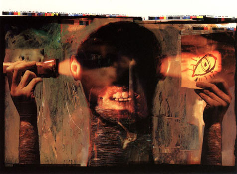
The hands are very realistically rendered, although the head itself is strange looking. It is fairly obvious that McKean has mastered the human form, however, as the shading and colors are photorealistic.


After seeing McKean's work, I can see that in order to find a pidgeon-hole of sorts in a specific field, it may be necessary to have a firm knowledge of other fields as well. In other words, it is okay to experiment with other mediums and not confine oneself to just one field.

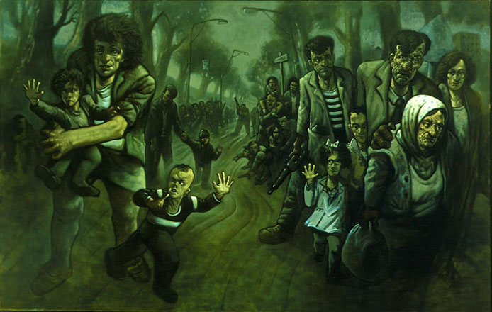
In terms of color, McKean's work seems to be very warm-color oriented. In fact, I had trouble finding a cooler color work.


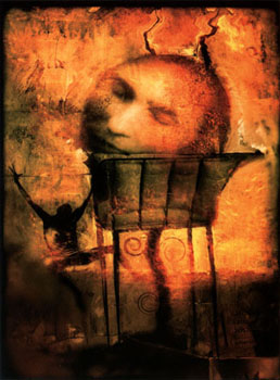
Again, McKean seems to identify with a warm temperature palette. Most of his works seem to be surreal in nature, and the images are often broken and fragmented. There is usually a clear dominance structure (as in this piece) and often a lot of negative space that is broken up through the use of color. The pieces are odd, to say the least, but I think that is what makes McKean so interesting.


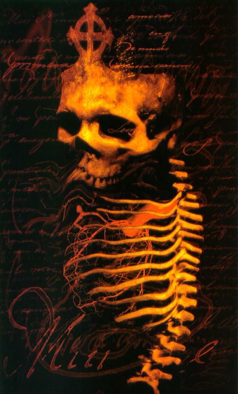
This piece creeps me out. As I said earlier, his work is very eclectic and has appeared most everywhere. He has had galleries in New York City, magazine and comic book covers, and CD covers. His signature is not often on his work, but it is very unmistakable.

In terms of how McKean produces his work, he usually combines the traditional approach of painting with techniques in Photoshop. He often incorporates text in his images, which we had to do earlier this year.


Overall, it has been interesting learning about Dave McKean and I have learned a lot from his work, even though I don't really understand what is going on in most of them. He is the quintessential artist and it is a shame that he is not widely known outside his fanbase.

Wednesday, November 29, 2006

Image Essay #15


The image above is a study by Josef Albers entitled “Homage to the Square,” which is actually part of a series. This particular image is very monochromatic – it has varying shades of orange. The repeated square shape helps reinforce this. It is said that the square is the “ideal” shape for his study because squares are related to each other in size (proportionally). The artist also pointed out that squares do not occur in nature, therefore it is man-made. I do not think that the image would be nearly as effective if the shape were circular or even a rectangle. The square is what makes this piece memorable.

Albers is credited for influencing geometric abstraction and minimalism. He was very interested in the psychological effects of color/space. It was his goal to question perception and its effects. The image forms kind of an optical illusion because the colors are changing and seem to be moving. They somehow support and oppose one another at the same time. Much like Kandinsky mentioned in a previous entry, Albers influenced abstraction heavily. While the shapes are simple, his studies were very extensive and it is reflected in the complexity of the image.

Image Essay #14


The piece above is a wallpaper for the online game World of Warcraft, made by my favorite company, Blizzard Entertainment. Their artwork has always astounded me. The logo itself has complimentary colors of a light blue and a dark yellow/orange. The dwarf on the right is painted in mostly earth tones, which make the gun stand out and come forward in the image. This adds a sense of three dimensionality. The background is a dwarven city in the mountainside. The borders on the top and bottom are also earth tones, which match the dwarf and serve to bring the logo and background image forward. It also employs the Gestalt principle of closure.

World of Warcraft is a video game, but even moreso it is a work of art. I have not been captivated by a video game like this at any point in my life, though I think I am a bit predisposed to playing video games. It could be argued that the first time I picked up a controller my life was altered, as I long for a career inside the industry. Working at Blizzard Entertainment would undoubtedly be my dream job. Everything in World of Warcraft was hand drawn. Everything. There was so much time put into that game, it really pales most other games for me. The game retains its cartoony look, but I personally prefer it over the more realistic looking games showcased nowadays with the next-gen consoles out. At any rate, World of Warcraft has set a fine example for games to emulate over the next few years and it will be interesting to see if another game could dethrone Blizzard.

Image Essay #13

Above is an image by famous Russian artist Vasily Kandinsky. "Compisition VII" was painted in 1913. Kandinsky himself said that this was his most complex piece of art. The colors are simply beautiful. Kandinsky was influenced heavily by music in his abstract pieces. His theories on music and art made him a widely respected art theorist as well. In his own words, Kandinsky said that "...color could be used in a painting as something autonomous and apart from a visual description of an object or other form." I personally find Kandinsky's pieces very gripping because I have always found color and abstraction to be more interesting than realistic painting. Kandinsky's theories are quite influential even today and it is easy to see why - he was one of the first defenders of abstraction and commanded respect.

Kandinsky is Russian and is credited as the first abstract painter. He studied law and economics in school but always had an interest in painting, though he was not considered an artist by profession until he was 30. Kandinsky moved to Germany and taught there until the Nazis closed down his art school in 1933. He then moved to France where he would spend the rest of life, becoming an official citizen in 1939. His theories on art and spirituality (and their relevance to one another) are still studied to this day. He published a number of books about the aforementioned theories that are still available.

Image Essay #12


In this very famous composition by Piet Mondrian called "Broadway Boogie Woogie," the artist really plays on a dominance structure and the use of triadic colors, or three colors of equal separation on the color wheel. The colors employed in this piece are yellow, blue, and red. By its very simple yet energetic composition, the viewer's eye is led all around the picture plane. There is a strong sense of movement in this piece. The squares seem to leap from the canvas and draw the viewer in. The fact that there is a triadic color scheme seems to cause the blues and reds to jump out.

The grid is actually real-world inspired. It is a city grid of Manhattan in New York City, and it is said that Mondrian enjoyed dancing to "boogie woogie" music. This piece also shows the influence that Mondrian had on modern day advertising and design. This grid look is used very often in advertisements. I have seen this particular piece (and others by Mondrian) without knowing exactly what they were. It is easy to see that Mondrian was very influential to modern art as we know it today and its continuing evolution in the future.

Image Essay #11


This is an image by American postmodern painter Mark Tansey entitled "Triumph of the New York School." In terms of the color selection, the piece is quite obviously monochromatic. The textures are emphasized in the various uniforms and surrounding landscape. The piece looks like a normal military surrender scene upon first inspection, but further review would alter that perception. On the left side of the table is what appears to be a French unit of World War I, while on the right there are clearly American G.I.'s of the Second World War. This, of course, would not be possible in reality because France and the United States never fought. Therefore, for interpretation, the deeper meaning has to be observed.

The "battle" cited in this painting is the rivalry between the art schools of New York and Paris, respectively. There are famous painters of the era within the piece, as well. Andre Breton, the famous surrealist, signs a treaty acknowledging defeat. Clement Greenberg is at his right, suited in the khaki G.I. getup. Behind him are Jackson Pollock, Willem de Kooning, and Robert Motherwell of the New York school. Henri Matisse and Pablo Picasso are also painted into the picture for the French side.

Overall this is a very interesting piece with several layers of meaning applied. It is also a great example of an allegory as discussed in class with the example being Alice in Wonderland. Tansey does a great job in this piece which makes it both gripping and memorable.

Image Essay #10

This is a piece by famous Impressionist painter Claude Monet entitled "Water Lillies." Monet was always very interested in the effects of lighting and reflections, and this piece shows a definite mastery of the subject matter. The piece is very intense and vibrant. There are analogous colors in the blue and purples of the water, which serves to make the lilies stand out. I personally think it is a very interesting selection of colors, but that was the trademark of the Impressionist style. It's just amazing because I know I would never be capable of painting anything like this.

Monet was very influential in the Impressionist movement as well as art in general. The term Impressionism was even derived from one of Monet's more famous paintings. Unlike most artists, he was fairly famous during his lifetime. Monet also had a lot of “series” paintings. He would paint the same object in different lighting conditions. It is very interesting to see his series of haystacks painted at different times of day. It really showcases the mastery Monet had over lighting. According to some historians, Monet suffered from cataracts in both his eyes, which he had surgery to correct. After the surgery it has been suggested that he was able to see ultraviolet wavelengths of light.

Image Essay #9


In class we were discussing the role of color in compositions. It was said that color not only enriches, it complicates the experience. When I think of color in painting, I think of Vincent Van Gogh. This is a self portrait from 1887, and his style is definitely evident here. There seem to be lots of earth tones in this work. There is a hint of blue and orange in Van Gogh's beard which seem to be split complimentary colors.

Van Gogh was born in 1853 and was a Dutch painter. He is generally classified as a Post-Impressionist painter. His paintings are some of the best known and popular works in history. The part that I found interesting about Van Gogh, though, is that he is the classic example of the "tortured genius" - he suffered from some type of mental illness. During one especially violent episode, he cut off part of his own ear. Another interesting tidbit about Van Gogh is that he did not “officially” become an artist until 1880 when he was 27 years old. All of his works, then, were produced in the last ten years of his life. Van Gogh's mastery of color and of the self portrait make his legacy relevant in today's world of art.

Tuesday, October 17, 2006

Blog Entry #4

ART:21 - Place

1. I think that it is a mixture of both. Places would not be known about without people, but people could not be people without places. I think a place is very powerful for us as humans, but I do not think that it completely defines who we are.

2. All the artists in this video are influenced heavily by the concept of places. For Richard Serra, he remembers being at the shipyard with his father at a young age - so his art is very massive, and he draws on the memory of looking up at the massive steel ships in lots of his pieces.

For Sally Mann, there is a recurring theme of nature, specifically in the South. Her children are often depicted in water or around nature of some sort, so specific places are often captured by her camera.

Barry McGee and Margaret Killagen are both influenced by trains. They draw heavily on folk art and graffiti - they often paint on trains, so the theme of the train station is very prevalent in their artwork.

Pepon Osario was heavily influenced by his first haircut that his father took him to - he made an art about that experience, incorporating his childhood into the work as well. All his art actually IS a place, so places play a key role in Osario's work.

4. I felt most connected to Barry McGee - his work seemed the most interesting to me. He noted how most people frown on graffiti as ugly. However, the billboards and advertisements all over the place are pretty? To him, the ads are the ugly things, not graffiti. I also liked how he pointed out that graffiti actually does very little harm to the site it's painted on - it can always be painted over. These jingles and slogans permanently embedded in ours minds cannot be disposed of so easily.

5. Richard Serra uses huge pieces of metal - the scale is enormous. It would be hard to see his work unless you are actually present at one of the site's his work is shown at. Sally Mann takes photographs - her work is accessible pretty easily. Barry McGee, like Serra, has work all over the place, but the work is immobile. Same deal with Pepon Osario - his work is mostly within buildings, so unless the viewer were actually within the building, it'd be hard to take it all in.

6. Old shack behind my aunt's house - creepy.
Grandma's cellar - even creepier.
Old Cleveland Browns stadium - loud.
Chuck E. Cheese's at age 5 - heaven.
Niagra Falls - beautiful.

7. The old Browns stadium was truly remarkable. There were way too many people packed into that building at every single home game - so close that you were nearly on the lap of the person next to you. The sizes of the people are all different, as are the textures. If looked at from afar, however, I'm sure it would be a blur of orange and brown. It was sunny, at least the game that sticks out in my mind. I also believe the Browns won that day, so it was quite happy.


ART:21 - Stories

1. Today, a common theme in stories is the chaos surrounding 9/11. There are tons of books, movies, and pictures of that day. Not to mention the news - I really doubt the media will ever stop talking about it. I think the story should be passed down to future generations (of 9/11), but it should be done in a tasteful manner. It should be factual and reasonable, rather than sensationalist or dramatized. The listener should understand the importance of the event, but it should not be overdone. So often things are blown out of proportion, which immediately disgusts lots of people. If it was kept reasonable, the person would understand without being turned off.

2. Some stories are told as opposed to others because they are interesting, for lack of better words. Certain stories are told over time because they are so compelling and relevant even to today's society, that people can continue to draw value from them. Other stories are lost to history because they come archaic and outdated - if people cease to relate to the stories, they will be forgotten.

3. The artists use their sketchbooks as a tentative plan for what their final product will be. I don't believe a journal or sketchbook is a work of art because it is not intended to be the final product. The word sketch implies rough and unfinished, and that is what a sketchbook is. I do not believe a work of art can be rough and unfinished, unless done so intentionally.

4. When I was 8, I liked to have fun. I played baseball and rode my bike a lot. I had dreams of being a professional baseball player. I was happy when we won and sad when we lost.

When I was around 8 years old, I spent my days outside running around, usually causing trouble. I played a lot of baseball and rode my bike around the road. I dreamt about much of the same - wreaking havoc and playing ball. I suppose I had a fairly common range of emotions - I was happy when we won our games and went to get ice cream and I was sad when I skinned my knees.

Wednesday, October 11, 2006

Image Essay #8

This is a piece by Marc Burckhardt entitled American Thoroughbred. The circuit of meaning here is pretty open to interpretation. Perhaps because the horse is camoflaged, Burckhardt might be saying something about war - how it seems to be desired in America. Aside from the artist's intentions with this piece, it is a very good composition. There is a high contrast between the grass in the front and the pastures behind, which helps to bring the grass and horse forward. There is a lot of tension in colors which also helps to provide a spatial illusion. The foreground is darker while the background is darker so the image of the horse really stands out, silhouetted against the sky and receding pastures.

Burckhardt also does a lot of portrains of famous musicians. There are some really interesting portraits of Kurt Cobain and Johnny Cash (by no means am I placing them in the same company by mentioning them together in the same sentence.) There are also some more bizarre works, like one that has a man being eaten by a dinosaur. How can you not be interesting in a man eating dinosaur? He uses a lot of interesting colors with high contrast so the forms really stand out from the background. He has a very interesting and unique style, I think.

Tuesday, October 10, 2006

Image Essay #7


This image, attributed to R.C. James, is rather famous in Gestalt psychology. It illustrates the concept of emergence - the dog is perceived at once as a whole. Because there are no pure forms, spatial relationships give the illusion of legs and the form of the dog. I found this image very interesting - almost like an optical illusion. There is a definite concept of grouping evident in this image - the congregated group of lines form the dog and the tree beyond. Closure, however, seems to be the most prevalent in this image. The shapes, taken alone, are simply fragments. Together, however, they form a picture.

It is very interesting that the mind seems to place together lots of shapes to form one single entity. According to Wikipedia, "the Gestalt effect refers to the form-forming capability of our senses, particularly with respect to the visual recognition of figures and whole forms instead of just a collection of simple lines and curves." To me, this is quite interesting - the human mind naturally pieces together what is missing. I can see how some optical illusions are formed; the notion of Gestalt is very prevalent. This picture pieces together what is missing to form a very interesting composition.

Image Essay #6


I chose this piece by Frank Stella, entitled Hyena Stomp, because I believe it is a good example of a Gestalt image. More specifically, the image has lots of movement, which leads to continuity. There is a definite focal point at the center of the image which helps to create drama. Also, there seems to be a sense of repetition along the borders, which leads to the broken pattern in the middle (also the focal point). Frank Stella has lots of movement in his work, which help to create a good composition. Most of Stella's work contains curved or straight lines with lots of different colors. It is interesting that Frank Stella is as respected as he is; he once said that a picture is "a flat surface with paint on it - nothing more."

In his work there is nearly always repetition with the repeated curves, and the movement is simply astounding. The image above I spent a good while staring at. Amazing, as it only consists of different colored lines. This further illustrates the point, however, that if a composition has unity and variety it will be good. There are both in Stella's piece, which is why it is a good representation of Gestalt imagery.

Image Essay #5


I chose a piece by an artist we talked about in class, Robbie Conal, as my image essay for this week. This work is entitled Martha Stewart Lying (as apparent by the title within the work.) I found this image particularly amusing. There is a lot of associative meaning and references to things normally associated with Martha Stewart. For instance, the magazine is entitled "Lying" in the same font of Martha Stewart's periodical, "Living." Not only is this a play on Martha's magazine, but the trouble she got herself into for doing just that. Insider trading, anybody? The gold tooth is what makes this image hilarious, in my opinion. It is associated with the hip hop culture and excessive money, which is what she was lying in order to retain. In the bottom left corner is a stereotypical "housewife" of the '50s, scolding Martha. Martha Stewart attempts to perpetuate that prototype of the perfect housewife.

Robbie Conal is famous for his skewed depictions of politicians and current events of the time, especially scandalous events. I have seen a few of his works around. After a little research on Conal, the way in which is distributes his artwork is quite interesting. Apparently he distributes his artwork (generally on posters) throughout cities during the night. I think I have probably seen his work in Time magazine. At any rate, Conal uses association to get his point across in his artwork, and that is exemplified in this piece.

Sunday, September 17, 2006

Image Essay #4


I chose this image by Scottish artist Peter Howson, entitled Road to Zenica. I believe this is a good representation of some of the topics covered in class this week. Not only is the circuit of meaning relatively open for interpretation, there are lots of small details. Needless to say, I spent a long time staring at this image attempting to make sense of it. There is a lot of depth as the image stretches back and includes a lot of people. Diagonals are also rampant, creating a very interesting composition with an illusion of space. The painting has a depressing appearance to it, and while the figures are very detailed, they're also distorted somewhat.


Initially the composition, while aesthetically pleasing, made little to no sense. I could gather that the people in the painting were migrating away from something, but I had little idea what. After a little research, I discovered that Zenica is a city in Bosnia and Hertzegovina that played a key role in the Bosnian War from '92 to '95. The city became a refugee center for ethnic Bosniak refugees seeking to escape the ethnic cleansing of the time. After a second viewing with this knowledge, the artist does a good job in capturing the mood of desperation and sorrow.


I found out about Peter Howson because he actually painted the cover of one of my favorite band's album covers. Live's 1994 CD, Throwing Copper has an image by Howson entitled Sisters of Mercy. That image always had an interesting look to it - I spent countless hours staring at that one.

Above: Live - Throwing Copper

Image Essay #3


In this piece by artist Chet Phillips, there is a good amount of tension. The round shapes of the animals in the boat are very circular in comparison to the very linear water and lines within the shapes. The cat's head is the dominant element in this work. The image also gives a good sense of movement – the eye goes from the cat, down into the water, up to the island, to the lighthouse – and around to the moon to where the viewer started. The subordinate shape is the owl, which is the second most important element of the image.

The author, Chet Phillips, has a very unique style. Looking at his site, he draws lots of animals along with lots of landscapes. After browsing his site, it appears he has done a lot of work for the Harry Potter series. Lots of assorted sketches and works are done by Chet Phillips for Warner Brothers.

This image has elements of tension, a clear dominance structure, and encourages movement around the work, so it seemed like a natural choice. There are also varying line weights and diagonal lines which provide depth, so this image encompasses lots of the concepts discussed in the past weeks.

Tuesday, September 05, 2006

Blog Entry #3

1. Before this Blog Assignment, had you ever kept a journal, diary, or blog? No.

2. Before this Blog Assignment, had you ever written about art before? A few times. Definitely not extensively.

3. Have you ever written for fun (poetry, fiction or non, journalistic, or research)? Often; journalistic. My dream job since I was little was to be a sportswriter but there is not the same circulation newspapers once enjoyed.

4. When writing, do you use a dictionary or thesaurus? Neither. I think it's like a soldier not wanting painkillers. Heck, I even code HTML in Notepad.

5. If given a chance, would you rather discuss art verbally or through written means? Written.

6. How would you rate your overall vocabulary? Above average.

7. How would you rate your vocabulary of art terminology? Below average.

8. How would you rate your writing abilities? Confident.

9. How would you rate your writing abilities when writing about art? Insecure.

10. How would you rate your ability to use specific vocabulary when writing? Average.

Image Essay #2


I chose this work by David Salle entitled Nouns. I think it is a good representation of some of the topics we covered in class this previous week. Salle's circuit of meaning here is very open, I think. The title does not help too much; nouns are virtually anything that can be drawn. The images are all easily recognizable, so there is a lot of iconography. Personally I can't make some type of profound insight on what this work might mean, so to me the circuit of meaning is very open. However, the image is aesthetically pleasing and there probably is a deeper meaning that I cannot derive.

The work has different panels with pictures inside each one, so I'm assuming the creator wants the viewer to look at is as you read a sentence, from left to right. The images all have names for them as well, and there is a site which lets you view them up closer. The titles are all one word and they are indeed nouns as the work's name would imply. There are a lot of linens throughout the image as well as statues, which together amount for about half of the imagery. Also it appears that the images with solid-color backgrounds go together in groups of four. Whatever the artist is trying to achieve, it is beyond my comprehension, so the circuit of meaning is very open for interpretation here.